You are here

Our Work

To get a good idea of all the options for our customised maps, please feel free to take a look at our earlier assignments. You can see that a map is not limited to any industry, media, or expression. For more information about a particular type of map, you can always contact us and ask about the options.

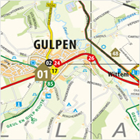
Very informative map with dozens of routes and interesting locations. The maps show a part of the Limburg area and are made in a customized map style.
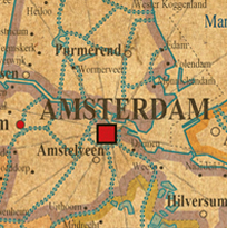
A set of ‘old fashioned’ maps designed for Scotch and Soda, used for rebranding of the company.
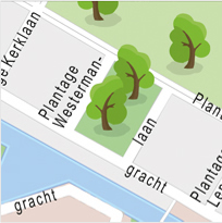
A couple of maps made for the well known parking lot giant in major cities and various countries. The maps are developed in a near childlike style with trees, splashy water and other personalized icons. Only to be seen in the car parks from Qpark.
Down South Media
 
Scotch & Soda
 
Q-Park


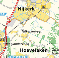
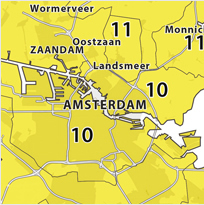
It may not look like a very special, or unique map. But what often makes a map work is the information you choose not to show. Simplicity speaks for itself, as it can be seen in this map. A region is shown with a 4 digit postcode layer.
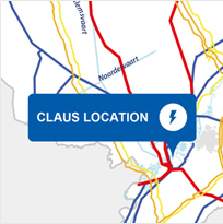
A map that is characterized by the eye-catching lines which represent the electric lines across the country. The map has been used in a presentation and was later enhanced with more specific data from owned power plants.
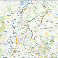
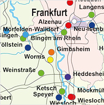
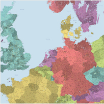
This map covers an area between the Netherlands, Germany and Belgium. Highlighting an area in which this company is active. The map style is made solely for this client. Additional information is added on the sides of the map.
Meditta
 
RWE
 
EU Region


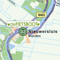
This map is based on our own ‘house-style’, but with added icons, routes and locations. The map acts as a folded up map and can easily be taken along while going walking or cycling.
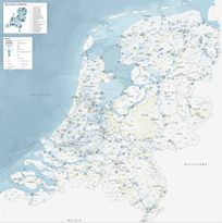
This very complete ‘water-map’ shows the Netherlands with all locks, water boards, rivers and canals. Several sources of information have been used, after which it has been bundled into a folding- and wall map.
A good example of a straight forward regional map. The map is clearly recognizable by the basic colours. Each colour symbolizes a different region. A simple map product; exactly as it should be.
Asset Media
 
BeensGroup
 
StolkerGlas


This map lets you see Germany with a large number of symbols. Each symbol represents something different in terms of the delivering and supplying of products. This map was ordered to function as an informative wall map.
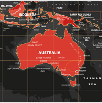
A perfect sample of a map in which the aesthetic aspects overpowers the informative part. The fiery red symbolizes the intense lava mass in the earth. Creating a striking contrast with the powerful black. Hence the name of the card: 'Volcanic'.
This micro booklet has been developed with the intention of assisting the ‘The Hague Police’. Digital navigation systems will always be preferred in this case, but having a non digital backup with you can sometimes be of high importance.
Kwetters
 
Own Production
 
Police The Hague


A huge map printed for the client as a wall map. The map itself is made up out of more than 16 separate maps. All countries are divided into provinces or states, and are divided even further into sub-states or cantons. The map itself is more than two meters.
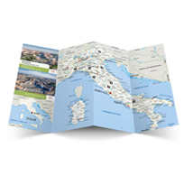
Labrys folding maps are provided to their customers that are participating in a Labrys group travel excursion. The client requested a customized mapstyle, which can be seen. Additionally, a metro map has been made for practical use.
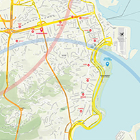
The 2016 games were perhaps overshadowed by the pericles in Rio, but these are not visible on this sparkling map of sunny Brazil. The map is specially made for the Dutch Consulate and served as a guide to inform the people involved in the Olympic Games.
De Jong Packaging
 
Labrys Travelling
 
Dutch Consulat Brasil


Customised maps

Have you been inspired or are you convinced that you’d like a map? Read more about the possibilities of your own customised map.

Request custom map

Also see

Custom Map
Size & Detail
Map type
Samples
Data
Map request